This post explores fod affordability inequalities among women-headed households in California using data-driven insights from machine learning models. The primary goal is to predict affordability ratios using features related to annual income, family demographics, and regional data. Additionally, the post includes anomaly detection to identify unique cases and SHAP analysis for feature interpretability.
Machine Learning Exploration into Food Affordability
Introduction
Problem Statement
Let’s talk about food affordability—a challenge that’s hitting home for many families across the United States. The struggle is especially real for single mothers, who often juggle the dual responsibilities of breadwinning and caregiving. For single moms in California, this issue is even more pressing, as the state’s sky-high cost of living leaves little wiggle room for essentials like groceries.
In this post, we’re diving into the numbers to see if we can predict food affordability for single mothers in California using socioeconomic and demographic factors. Here’s what we aim to uncover:
-
How income, location, and ethnicity tie into food affordability.
-
The potential of machine learning models to predict food costs.
-
How these insights could spark changes in policy to create a more equitable future.
Exploratory Data Analysis
To make sense of the challenge, we start with the raw data. Think of this as our foundation—it’s where we look for patterns, trends, and surprises.
Here’s what we’re working with:
affordability_ratio(numeric - target variable) Ratio of food cost to household incomemedian_income(numeric) Median household incomerace_eth_name(string) Name of race/ethnic groupgeotype(string) Type of geographic unit place (PL), county (CO), region (RE), state (CA)geoname(string) Name of geographic unitcounty_name(string) Name of county the geotype is inregion_code(string) Metropolitan Planning Organization (MPO)- based region codecost_yr(numeric) Annual food costsave_fam_size(numeric) Average family size - combined by race
So what does the data tell us? Let’s break it down.
| Metric | Example Insights |
|---|---|
| Income | Median household income is just $33,103—way below the U.S. average of $80,610 (2022). |
| Affordability Ratios | Larger families have higher costs, but the struggle to keep food affordable spans all household sizes. |
| Ethnicity & Location | Ethnicity and geography have a noticeable impact on both income and food affordability. |
Table 2: Summary Satistics
One striking pattern? Larger family sizes mean higher food costs, which makes sense. But when you factor in income disparities by ethnicity, the affordability gap becomes even clearer.
Methods
Feature Engineering
Data transformation is where the magic happens. Here’s how we made the raw data ready for modeling:
-
Added Latitude & Longitude: More precise geographic details give our analysis a local edge.
-
Introduced a Food Cost Index: By comparing food costs to the national average, we can see where California single moms stand relative to the rest of the country.
-
Handled Missing Data: Using imputation, we filled gaps without losing valuable insights.
Supervised Learning Models
Several supervised learning models were tested on this data to test the relationships between features and the target variable. Each model was assessed based on the performance metric root mean squared error (rMSE), computational time, and challenges that occurred with the process. The table below includes the summary on these models and metrics.
| Model Name | Performance (rMSE) | Key Insights |
|---|---|---|
| XGBoost | ⭐ Best ⭐ | Balances accuracy and speed, with built-in overfitting prevention. |
| Decision Trees | Good but overfits | Simpler but less robust. |
| Deep Neural Networks | Decent | Promising, but not worth the extra computational cost. |
Table 5: Supervised Learning Models
Discussion on Model Selection
Why XGBoost Wins
-
Accurate Predictions: It captured the nuances of the data better than linear models.
-
Efficiency: It’s faster than deep learning models while still delivering top-notch results.
-
Interpretable Insights: Tools like SHAP help explain its predictions, making it easy to translate results into actionable steps.
XGBoost Hyperparameter Tuning
To build the most optimized version of the XGBoost Regressor, hyperparameter tuning was conducted using the grid search approach. The goal of this method was to provide many possible combinations of hyperparameters and identify the ones that minimize the model’s prediction error on the training data, while also balancing the model’s ability to generalize to unseen data. The following hyperparameters were tested:
-
n_estimators: Controls the number of trees in the model -
learning_rate: Controls the step size for updating model weights -
max_depth: Specify the maximum depth of a tree -
subsample: Fraction of observations randomly sampled for each tree
With these hyperparameter options, GridSearchCV tested all combinations and evaluated them using 5-fold cross validation, which splits the data into 4 training subsets and one validation. This tuning process was effective in ensuring that the model was fit properly, and contained hyperparameters that control the model’s over/under-fitting tendencies.
SHAP for Feature Importance
Shapley Additive Explanation (SHAP) values are a strong tool that can help interpret the information generated from the XGBoost Regressor’s predictions. They act as a general framework that can be appplied to models, and explain their outputs by uniformly quantifying feature contributions.
I. Model Performance Evaluation
One thing SHAP can be used for is to see how predicted values compare to actual values to evaluate model performance. From these comparisons, we can gather examples of true positives/negatives and false positives/negatives from the model’s output.
-
True Positives/Negatives (TP/TN):
A predicted affordability ratio of 0.35778 for an individual compared to the actual ratio of 0.3580 has an error of close to zero (0.0003) which is insignificant at the chosen 0.01 level, thus suggesting that the model is accurate in this instance.
-
False Positives/Negatives (FP/FN):
A predicted affordability ratio of 0.4980 compared to the actual value of 0.5084 has an error of ~0.104 which is significant at the chosen 0.01 level. Since the model incorrectly classified this individual higher than their actual affordability ratio, this is a False Positive overprediction. An opposite instance with negative error would represent a False Negative underprediction.
II. Feature Contributions
To continue interpreting the XGBoost model predictions, SHAP can be used to quanitfy and visualize feature contributions. This can be done on a global scale by identifying the most influential features across the dataset, and locally to visualize individual predictions.
A SHAP summary plot helps to identify features by ranking them based on their average absolute SHAP values.
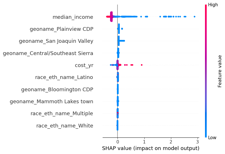
As seen in Figure 1, the feature median_income is a substantially influential variable in the model. When median_income is high, overall predictions for affordability_ratio decrease slightly, and when median_income is low, affordability_ratio increases substantially. Similar relationships can be interpreted for the other features on the SHAP global feature contributions plot.
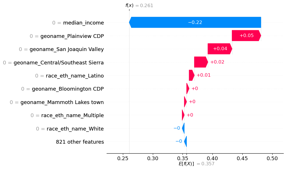
To see the feature impacts on a specific prediction, the waterfall plot in Figure 2 shows that median_income contributes -0.22 to affordability_ratio, pushing the prediction lower than the baseline expected prediction of 0.357. geoname_Plainview CDP contributes +0.05, also pulling the prediction for affordability up. These features in combination with the others captured in Figure 5 contribute to pushing the final prediction for this particular individual to a predicted affordability ratio of 0.261.
SHAP is a powerful tool used to interpret the XGBoost predictions by qunatifying the contributions of each feature to the model’s output. Key global features that are particularly influential were identified by SHAP’s global analysis, and local analyses from the waterfall plot provide insight into individual predictions. These interpretations allow models to be applied to real-world implications by ensuring that the predictions are easily explainable.
Anomaly Detection & Cluster Analysis
The next step in understanding the data and chosen model is to find observations or patterns that deviate significantly from the norm. This may include underpredictions, overpredictions, or unexpected feature combinations.
I. Anomaly Detection on Affordability
To detect affordability anomalies, the dataset can be clustered into 3 groups based on affordability. This clustering techniques helps with uncovering general patterns in the distribution of the target, while outlining extreme cases to be aware of.
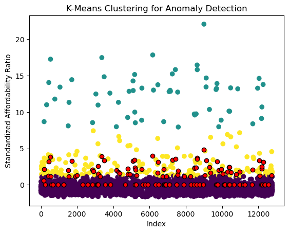
In Figure 3, anomalies are highlighted in red. These were calculated by selecting the top 1% of affordability ratios farthest from their respective cluster centroids. Such large distances indicate these individuals likely have unusually high ratios given the surrounding averages.
II. Cluster Analysis on Affordability, Family Size, and Ethnic Group
Analyzing clusters can be expanded to tracking multiple features. In this case, looking at family size and ethnicity can uncover important affordability subgroups.
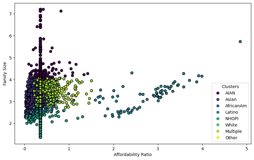
In Figure 4, the cluster groupings are within close proximity of each other, but there is a clear visual difference from one ethnic group to the next. There are many iterations of this type of subgroup clustering that would provide valuable insights regarding various factors. Providing this type of analysis can be used to inform certain political interventions to help subgroups that would benefit from government action.
Dimension Reduction
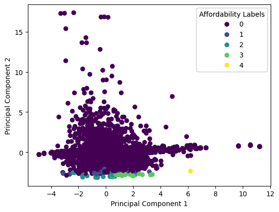
The topic used to understand this dataset is dimension reduction. This step is included to simplify the complexity of the data, making it easier to analyze. Since some of the features in this dataset were One-Hot Encoded, it has high dimensionality from the numerous binary features. This section will focus on applying Principle COmponent Analysis (PCA) and UMAP to transform the data.
I. PCA
The first step is to fit PCA to the training predictors. Since the goal is to find a linear transformation of the original data that mximizes the variance of the data, the graph below helps to visualize what this process looks like for our case.
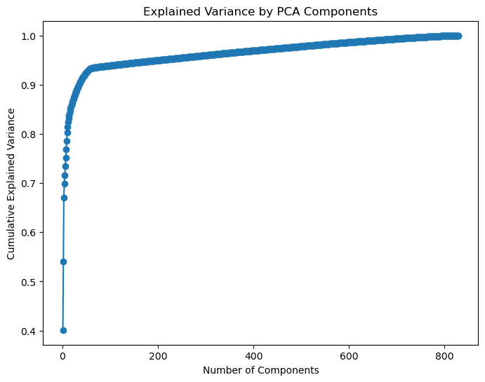
From this, we know that to retain 95% of the variance, we need 203 components. The next step is to find the hyperplane that preserves the largest amount of the variance, and project the data onto that hyperplane. Figure 6 shows that PCA does capture some of the distrinctions between different affordability groupings, but is not ideal.
The new X_train_pc and X_test_pc could be used in the XGBoost model for improved performance. Fitting the optimized model to these new training and testing sets yieled a rMSE of 0.0776 which is higher than the original model’s result (0.0153). This could be due to the fact that the dimenion reduction values are not complex enough to explain the behavior in the data well.
II. UMAP
UMAP is an example of a manifold learning method to see how a non-linear dimension reduction algorithm would perform on this data. There are multiple manifold learning options, but UMAP is generally faster than tSNE, another popular choice, and balances global versus local relationships better than tSNE as well.
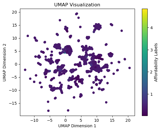
Since UMAP is being used for visualization purposes in this report, a 2D representation of the dat is not extremely informative or useful. Additionally, UMAP took significantly longer than PCA which adds to the disadvantage of using it as the key dimension reduction technique for this analysis.
Conclusion and Next Steps
This analysis shed light on the intricate relationships between income, family size, ethnicity, and food affordability for single moms in California. Our findings suggest that regional disparities and systemic challenges—like low wages and high grocery costs—are major factors driving the affordability crisis.
What’s Next?
-
Policy Impacts: Use this data to guide subsidies or expand food assistance programs in high-need areas.
-
Refining the Model: Incorporate hyper-local data (like zip codes) for sharper insights.
-
Advocacy: Push for systemic changes, like better access to affordable housing and higher-paying jobs.
Food affordability isn’t just about numbers—it’s about ensuring that every mom can provide for her family without breaking the bank. By digging into the data, we can take the first steps toward a more equitable future.