A brief tutorial post to get other stat 386 students familiar with using Seaborn as a data visualization tool.
Exploratory Data Analysis with Seaborn
Opportunities in fields related to machine learning, data science, and statistics have grown immensely in recent years. As students learning how to operate in this realm, it is important to be aware of all the tools available to you. A huge aspect of working in one of the fields listed, is data interpretation, and having the ability to communicate our findings to other career professionals. In order to do both of these jobs effectively, we will need certain tools to help us. One of the leading packages in Python for data visualization and manipulation is Seaborn. I have used Seaborn in a previous Data Science course, and I felt it would be an extremely useful tool to share!
What Can We Do With Seaborn?
Seaborn is a library in Python that can be imported. It is built on top of Matplotlib, and is very easy to use with Pandas DataFrames which we have already begun using in class. While there are numerous ways to use Seaborn to gather useful information from data, I have the most experience in using it to create data visualizations, so this blog will go into more detail about using features related to those kinds of applications.
Data Visualization Tools in Seaborn
There are 17 built-in datasets that are available to use when importing Seaborn. The sns.get_dataset_names() function lists all the possible datasets one can choose from. For the content in this blog, I will be using the tips dataset, which provides information on tip amounts given total_bill amount ($), sex (M or F), smoker status, day, time, and party size.
pip install seaborn #if not already installed on your device
import pandas as pd
import seaborn as sns

tips = sns.load_dataset("tips")
Boxplots, Scatter-plots and Distribution Plots
To look at a graphical representation of the distribution of certain variables in a dataset, we can use boxplots. In Seaborn, the sns.boxplot() function allows us to to do this. There are many parameters that can be included, but the most basic required arguments are an x and y variable, as well as a data argument. To add specific axis and title labels, you can use the .set() function with any necessary parameters.
sns.boxplot(data = tips,
            x = "size",
            y = "tip").set(title = "Boxplot of Tip Amount by Party Size",
                            ylabel = "Tips ($)",
                            xlabel = "Party Size")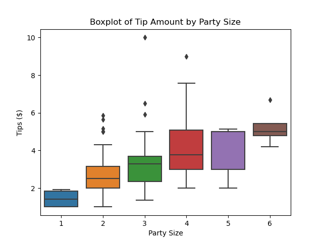
scatterplot() can be used to look at the relationship between two continuous variables, but Seaborn also has a lot of other features to make our plots more informative. For example, the plot below colors each data point by size so we can also understand the relationship between party size and amount spent all in one plot.
sns.scatterplot(data = tips,
                x= "total_bill",
                y = "tip",
                hue = "size").set(title = "Scatterplot of Tip Amount by Total Bill Amount",
                                ylabel = "Tips ($)",
                                xlabel = "Bill Total ($)")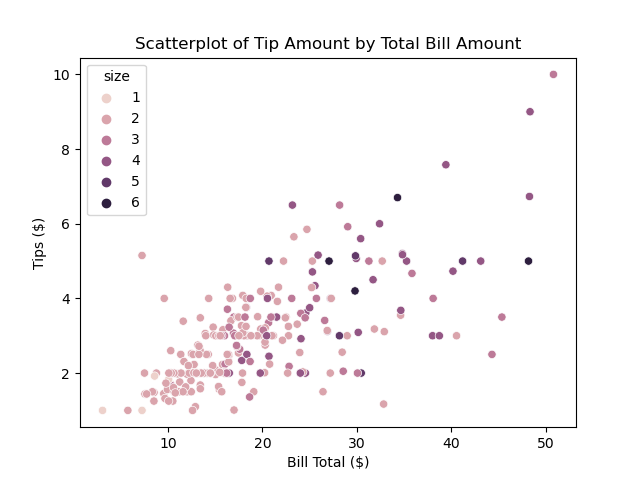
If we were interested in visualizing the distribution of variables in our dataset, Seaborn has a unique function displot() which allows for many different methods of visualizing various distributions. This can be useful in data analysis when deciding potential predictor variables, trends, and outliers in our data. The example below uses a histogram to represent distributions of tip amounts for different times of service.
sns.displot(data = tips,
            x = "tip",
            col = "time",
            kde = True).set(ylabel = "Frequency Count",
                            xlabel = "Tip Amount ($)")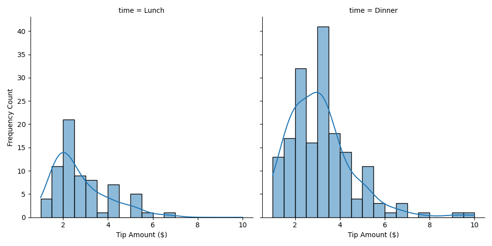
Pair Plots
The Seaborn pairplot() function allows us to see all the joint and marginal distributions for pairwise relationships occuring between the variables in our dataset. This can be very useful when conducting correlational analysis - we are able to quickly visualize potential correlations between all variables.
sns.pairplot(data = tips, hue = "time")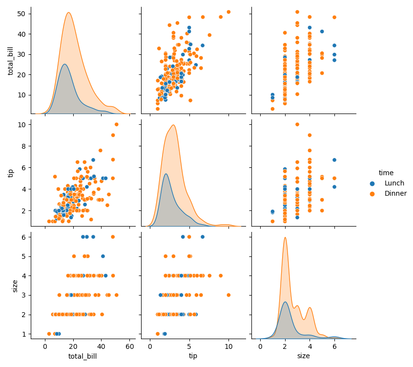
Conclusion
This blog post has explored how to get started with Seaborn, specifically, how to use it to create compelling visualizations of data. I have covered how to install Seaborn, and creating basic scatterplots, boxplots, and distribution plots, as well as a more advanced pair-plot. There are also many ways to customize your plots with color, hue, and size arguments. Below I have included a link to Seaborn’s website which includes a lot of other useful content for conducting exploratory data analysis, so I encourage you to briefly look at other useful topics they included. Hopefully after reading this blog post and Seaborn’s official website, you feel ready enough to begin using Seaborn for future data science projects!